Machine Learning: Diabetes Analysis Prediction
What is Diabetes?
Diabetes is a chronic disease that occurs when the pancreas is no longer able to make insulin, or when the body cannot make good use of the insulin it produces. Learning how to use Machine Learning can help us predict Diabetes. Let’s get started!
About this project :
- The objective of this project is to classify whether someone has diabetes or not.
- Dataset consists of several Medical Variables(Independent) and one Outcome Variable(Dependent)
- The independent variables in this data set are :-‘Pregnancies’, ‘Glucose’, ‘BloodPressure’, ‘SkinThickness’, ‘Insulin’,‘BMI’, ‘DiabetesPedigreeFunction’, ‘Age’
- The outcome variable value is either 1 or 0 indicating whether a person has diabetes(1) or not(0).
About the Dataset
- Pregnancies :- Number of times a woman has been pregnant
- Glucose :- Plasma Glucose concentration of 2 hours in an oral glucose tolerance test
- BloodPressure :- Diastollic Blood Pressure (mm hg)
- SkinThickness :- Triceps skin fold thickness(mm)
- Insulin :- 2 hour serum insulin(mu U/ml) BMI :- Body Mass Index ((weight in kg/height in m)^2)
- Age :- Age(years)
- DiabetesPedigreeFunction :-scores likelihood of diabetes based on family history)
- Outcome :- 0(doesn’t have diabetes) or 1 (has diabetes)
Data Visualization
Here we are going to plot :-
- Count Plot :- to see if the dataset is balanced or not
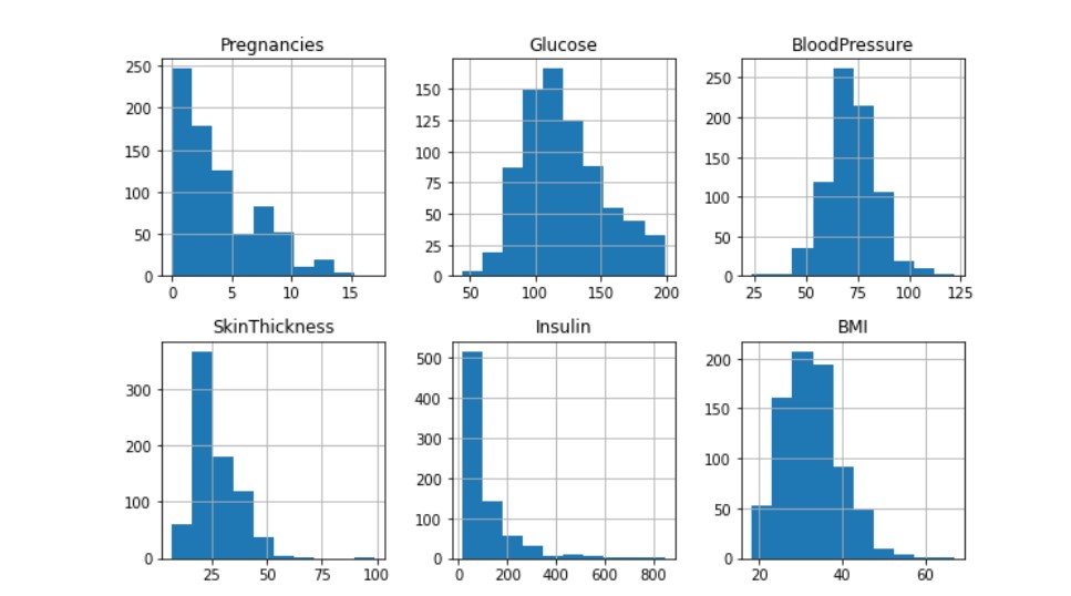
- Histograms :- to see if data is normally distributed or skewed
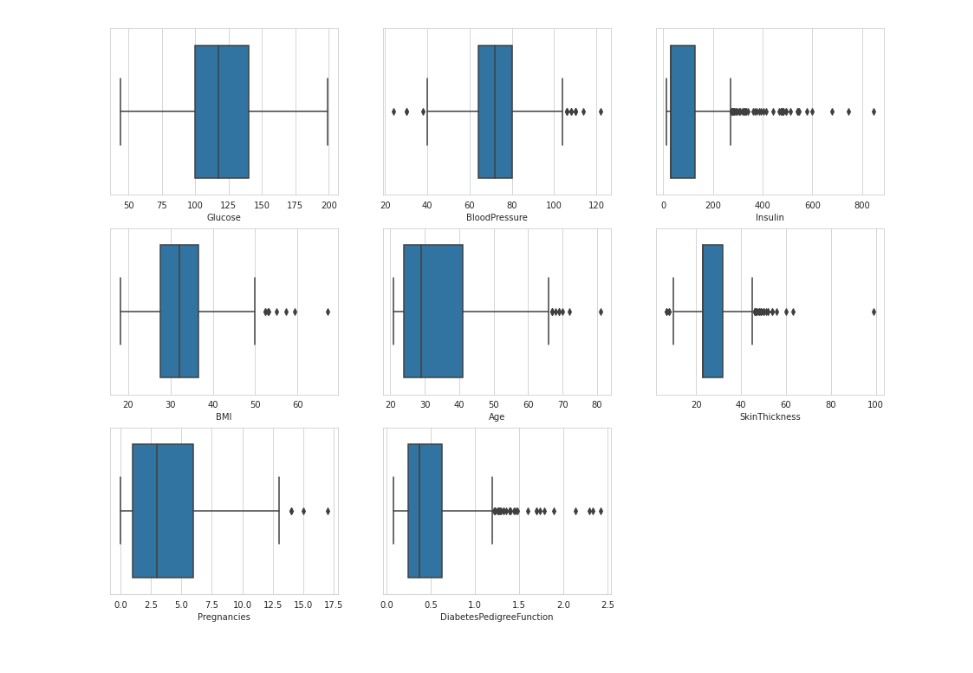
- Box Plot :- to analyze the distribution and see the outliers
- Scatter plots :- to understand relationship between any two variables
- Pair plot :- to create scatter plot between all the variables

Conclusion :- We observe that only glucose and Blood Pressure are normally distributed rest others are skewed and have outliers.

Outliers are unusual values in your dataset, and they can distort statistical analyses and violate their assumptions. Hence it is of utmost importance to deal with them. In this case removing outliers can cause data loss so we have to deal with it using various scaling and transformation techniques.
Feature Selection
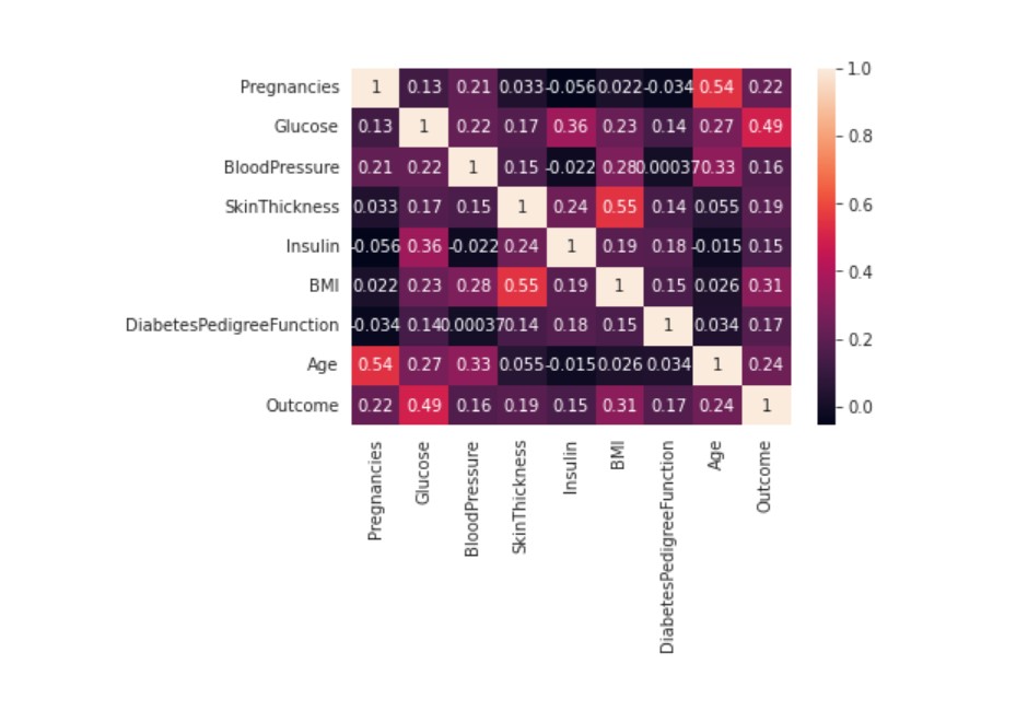
Pearson’s Correlation Coefficient : Helps you find out the relationship between two quantities. It gives you the measure of the strength of association between two variables. The value of Pearson’s Correlation Coefficient can be between -1 to +1. 1 means that they are highly correlated and 0 means no correlation.
A heat map is a two-dimensional representation of information with the help of colors. Heat maps can help the user visualize simple or complex information.

CONCLUSION :- Observe the last row ‘Outcome’ and note its correlation scores with different features. We can observe that Glucose, BMI and Age are the most correlated with Outcome. BloodPressure, Insulin, DiabetesPedigreeFunction are the least correlated, hence they don’t contribute much to the model so we can drop them. Read more about this here :- https://towardsdatascience.com/feature-selection-techniques-in-machine-learning-with-python-f24e7da3f36e I have used 3’rd technique method mentioned here.